Friday, 22 February 2013

Colouring In Is Fun

I was really pleased with my final mounted prints. One acrylic etching, one lino cut and one mono print. Although I can't abide the latter process as it's so messy and uncertain.  Overall, I've really enjoyed the print workshop. 


Ros also showed us some collagraph prints which I really liked and might look to use in my FMP.


And then, this afternoon, I did a drawing that I actually like. He looks rather top heavy here, but didn't in reality (I don't think!) I was really brave in terms of daring to colour him in and shade. (And yes, I'll admit, Duncan did some of the hard bits for me!)


Thursday, 21 February 2013

Art I've Recently Seen

Have seen some great art recently in Bath and Salisbury.

In the Adam Gallery in Bath I loved the colours and the simplicity of the work by Elaine Pamphilon.


 I also really loved this tiny painting by Michael Hyam and I'm going to attempt to create something similar in my final painting (to be done in oils. Gulp).

Question: is copying bad? I'm not sure. I'm not going to try and profit from copying, and I know it's a great way of learning. But it's an interesting question, all the same.


In the Victoria Galleries I loved the photography of Roger Mayne. Again, it proves just how much better black and white is than colour in terms of impact (and that fixed lense cameras definitely have their merits). He photographed a 'slum' street in London over many years, and his photos are wonderfully evocative of the sense of community and the period in which they were taken.


We also really liked the work of a French print maker, creating prints (mono prints and metal based ones). I can't remember her name, nor the name of the gallery, but here are some photos. The works really grow on you but they are quite 'plain' some might say:

 I love these two prints alongside one another.


 We also really loved the way they were double framed in oak.

Finally, in the Fisherton Mill Gallery in Salisbury, it was really useful seeing the linocuts of John Walker as they gave me the idea to just spot colour one bit of one of my lino cuts. I couldn't find an example from him, but in the ones I saw he would simply colour, say, the shape in the sky red, with great effect.


My hand-coloured prints - one lino cut, one acrylic etched.


Monday, 18 February 2013

Frame Dog

I love Simon at Frame Dog, and this is pure advertising for him. He's really lovely. He's really professional and he's incredibly good value:  http://www.framedog.co.uk/

I decided at the start that I would treat whatever I painted with respect and get it all properly framed. So that's what I did today. I really enjoy the process of choosing frames, and, looking at my paintings spread across his kitchen floor, I was very chuffed. It's amazing what a difference a frame makes to a piece of work (especially, I thought, the Abstract one).

I'm hoping to finish one more by Friday, and that will be it. A good enough effort I think.


Imani in a Hat

So, my portrait of Imani. My least favourite so far (no offence, Min) and the most experimental.

I began by trying some collaging, sticking poems and fabric on the board. 


I didn't want it to be entirely representational (eg the fabric cut in the shape of the hat). However, the problem is that, if it's not, it stops in random places when you're painting.

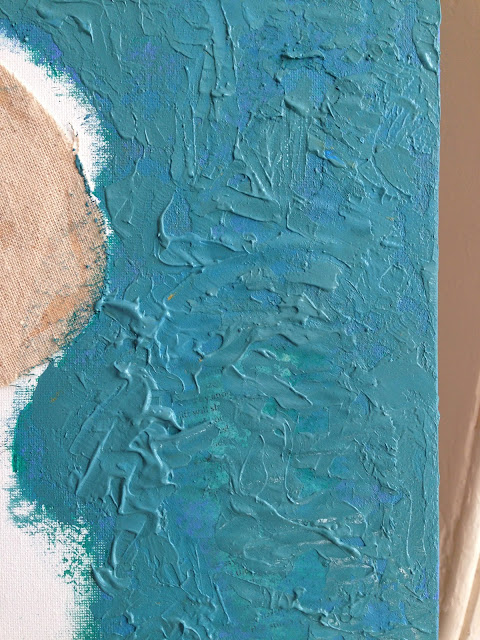
So I then started painting much more thickly to compensate for the different levels of texture:


Then, I decided that I didn't like the poems and how they were looking (and they were also placed too symmetrically around the board, so I painted them over. I discovered in the process that I love painting with a palette knife.

I then decided the overall look was too green, and made it more blue. Then finally I painted thickly everywhere else as well.

It's ok. I made the hands worse than they were, but in finishing it I like it much more than I did as I was going along! I particularly like the little detail of Imani's ring, and I do like the overall testures.

Before I messed up the hands


The final one. I'm pleased because I would normally avoid painting skin tones like the plague. I like the textures (although she has a burnt looking arm because of some of the paper placement) and I'm pleased with the colours.

 The hands are still a bit rubbish. Bnd it's original. And I painted it. And it's mine.